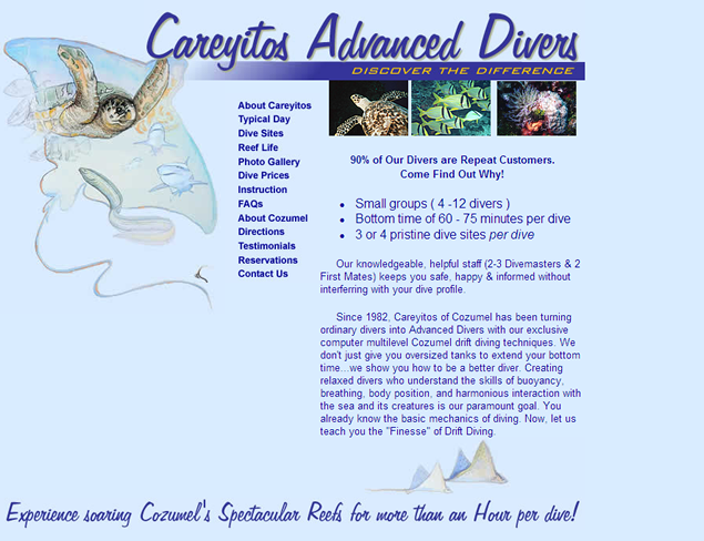
Contact me: Lauren@perigeestudios.com or 240-281-8852
Former CIA spies, Antonio and Jonna Mendez needed a web site to promote Tony's first book, The Master of Disguise.
The site design combines elements from the book's dust jacket with a simple navigation encouraging visitors to explore and ultimately purchase the book.
The customer recognized that the existing intranet had been allowed to grow organically and was no longer meeting user needs.
The project involved combining user needs identified during requirements gathering with the stakeholder desires. One of the biggest challenges was implementing the site in SharePoint 2010.
Screenshot has been redacted, but is indicative of the site architecture and graphic design.
This tour company, specializing in custom packages to some of the most spectacular sites in Argentina, needed a full marketing package to present their clients with a hint of the passion and vitality of the locations they represent. As all tours begin in Buenos Aires where the Argentine tango originated, the logo features stylized dancers in the close embrace characteristic of the dance.
A small home owner's association needed a new web site to help it communicate with neighborhood residents. The project had a very minimal budget to cover all aspects of design and development.
This site was developed to market natural health care products. The client wanted verdant colors in a simple design to emphasize his selection of homeopathic products.
With a major mailing campaign in the works, Photographer Brendan Mattingly needed a new site that would catch the eye of potential clients while allowing him to update his online portfolio frequently. Color is minimal to allow his photographs to pop.
This site uses embedded flash and quicktime animations and extensive use of mouseover effects.
It was vital to create a site that highlights the qualities that make Careyitos different from the other 100 shops competing in Cozumel. A clickable map of dive sites, dive prices, testimonials, and photos contributed by their customers, all add up to a beautiful site that's packed with the information divers need to plan a trip to Cozumel. Because Careyitos does not have an American office, an essential new feature was the online registration form allowing divers to sign up for dive trips without an expensive international phone call. And the entire site is database driven, allowing the Careyitos staff to modify the content to keep the site fresh.
All discussions with this Mexican company were done via email.
A month after going live, the site had paid for itself with new customer revenue.
A personal trainer wanted to include the internet in his marketing strategy. The site was designed with an eye toward search engines and providing enough information to encourage people to contact the trainer directly.
With a national election looming, it was vital for this site marketing a just-completed upscale housing development steps from the US Congress to be published in time to attract newly elected officials. From domain name registration to deployment, the site was completed in less than one week.
CTIVS group provides a variety of video, online meeting, and conference room design services to other institutes within the National Institutes of Health.
It was absolutely critical that the site design met 508 requiremenst as well as all HHS policies for online media while providing an informative and engaging experience for customers.
A high-level prototype was created to explore new possibilities for a professional entertainer.
FoodPro needed to scale up its online image to match its expanding marketshare. Existing content was restructured for better usability. Corporate branding and collateral were incorporated throughout the new design.
This site was developed to market outpatient cosmetic procedures and natural health care products. The client wanted a clean, professional look to add authority to this new business venture.
This site was developed to provide information about Pilates to potential students and generate new business for this exercise studio.
When these spies turned authors published a second book about their careers in American Intelligence, the existing site had to be modified to emphasize Spy Dust, while blending with the pages dedicated to the first book.
Once again, critical elements from the dust jacket were rearranged to fit the horizontal aspect ratio of a computer screen. The book title inspired the navigation bar's glowing footprints and spy terms from the book are used for page titles. Moving the mouse over a link simultaneously causes the definition of the term and a pulldown menu, to appear. Actual photos from the authors' lives and links to the CIA and the International Spy Museum add reality to the otherwise surreal content.
The original site for this engineering firm supporting the Defense Industry was unprofessional and uninviting.
With its approaching US Destroyer, a new cross-hair logo, and sharp blues on white, the new site makes a powerful first impression. Throughout text is highlighted with photographs from the defense industry, keeping the pages interesting while dramatically illustrating SEG's strengths. Recognizing that radar systems engineering is one of SEG's primary interests, the harsh, generic radar sweep image from the original site was transformed into a more subtle map targeting corporate locations.
When he published a sequel to his first novel, this author's site designneeded a sequel as well. The original design was modified to incorporate the new book while maintaining the existing content. Modifying the dust jacket design to meet the size constraints of a computer monitor required extensive graphics work.
This site was created to explore possible ways to combine branding elements of both the USPS and eBay to create a site aimed at driving eBay sellers to increase their use of USPS shipping products and services.